Graphic identity
South
Series Festival

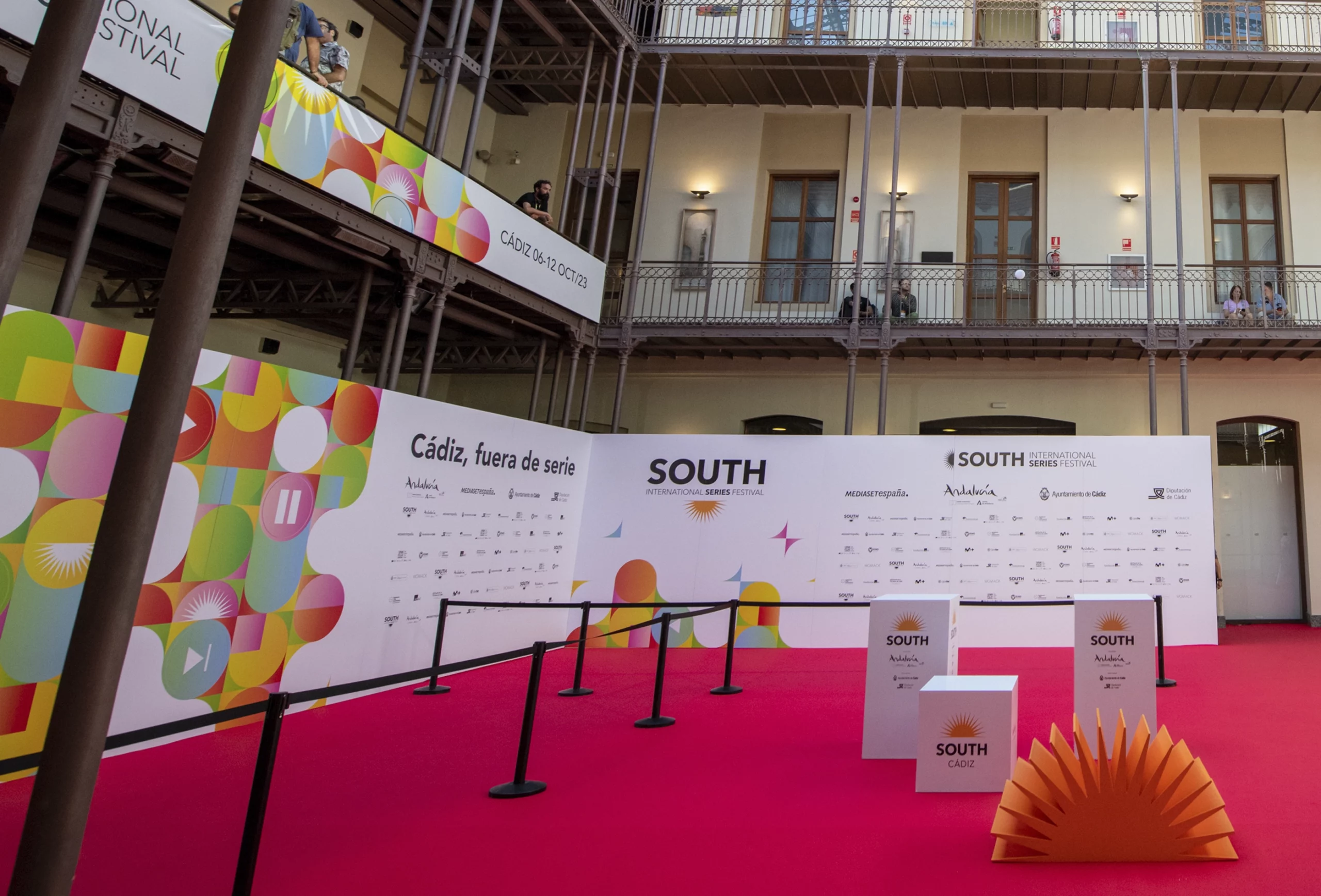
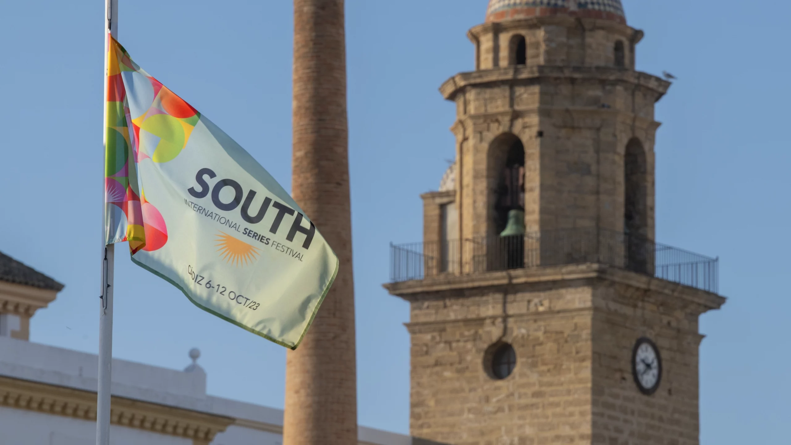
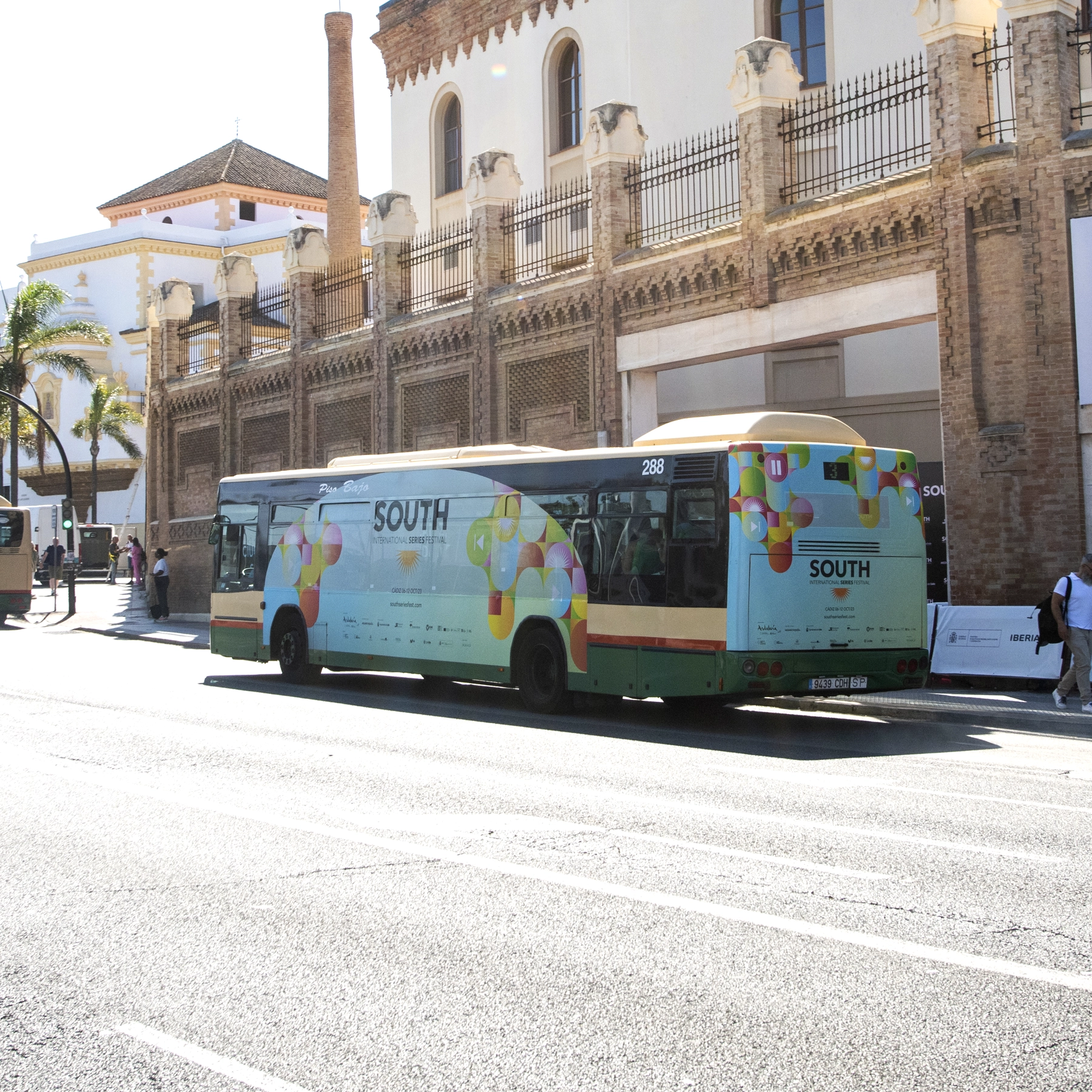
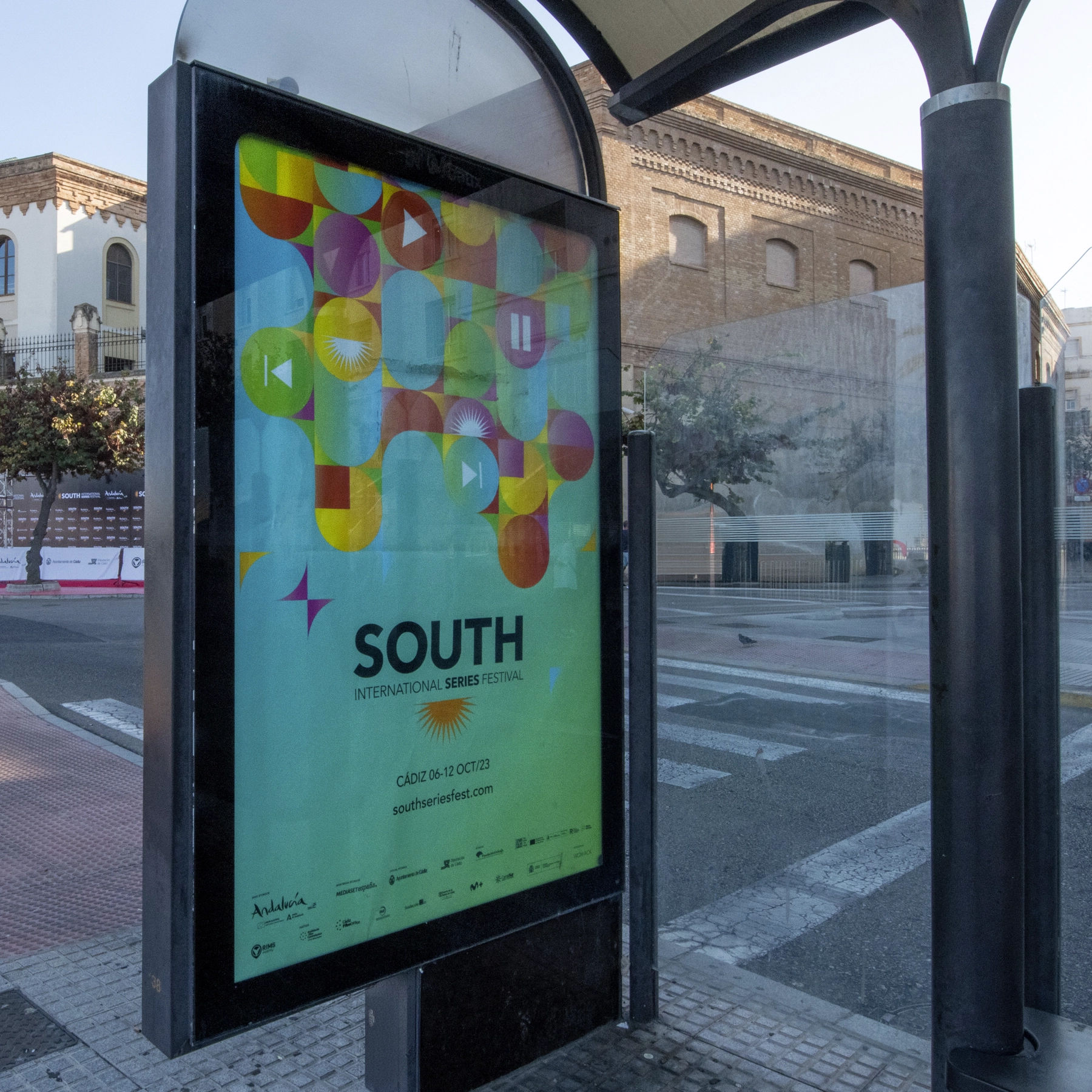
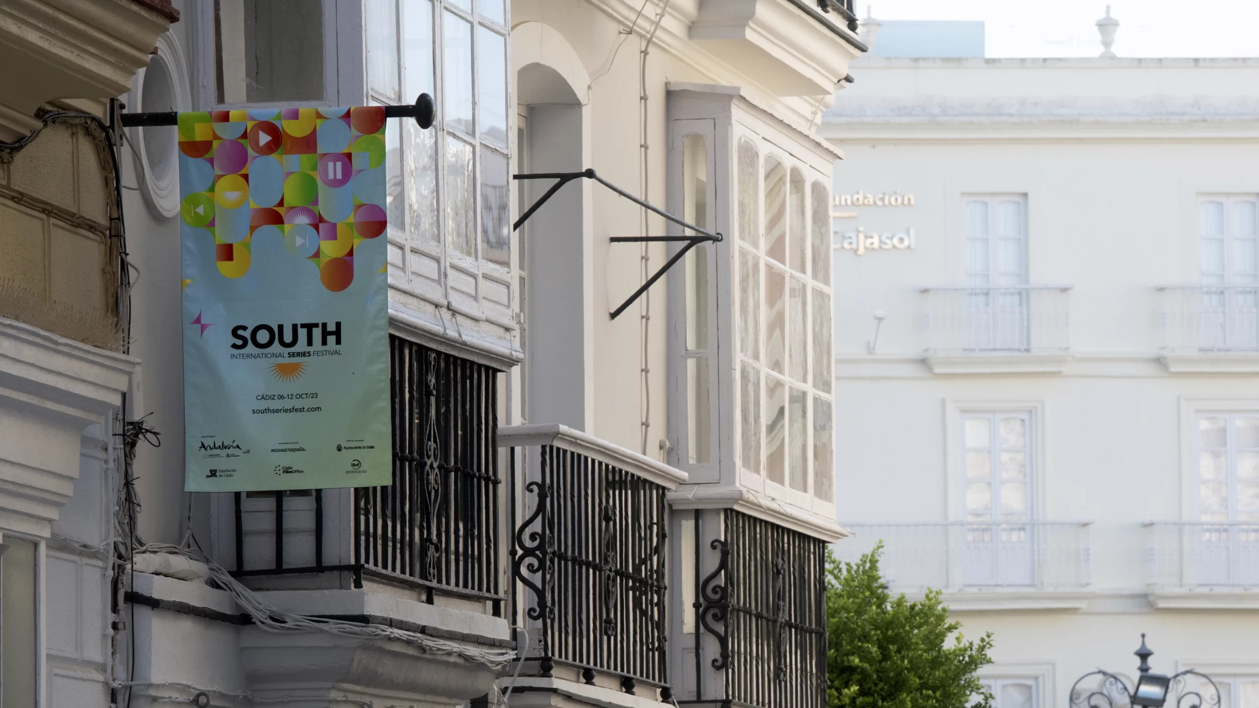
Ana Locking developed the graphic identity for the first edition of the South International Series Festival in Cadiz, creating a poster that captures the light and energy of Cadiz and southern Spain.
The design reflects the sun over the sea, the joy of Cadiz and the spirit of fun and passion that characterises its festivities, all through a palette of vibrant and dynamic colours. Each visual element interacts with the others in a colourful puzzle, symbolising the multicultural nature of the stories told by the series and the richness of their creative universes.
The result is a graphic identity that not only communicates information, but also conveys sensations, emotions and the unique character of the festival, connecting local culture with a contemporary and universal visual language.
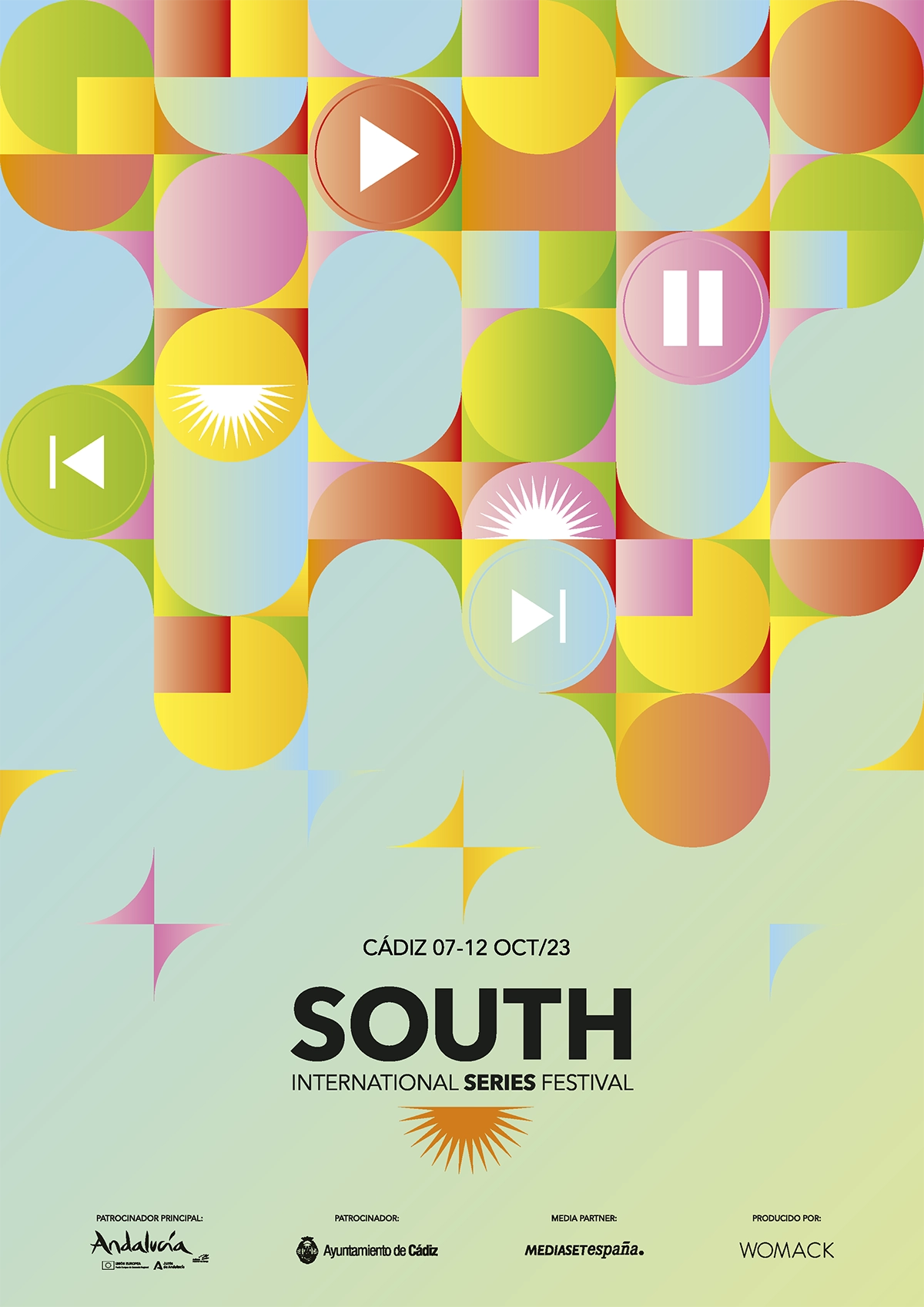
Cartel